Category: Art

  • Trompe-l’œil

    Trompe-l’œil

    That word in the title is not a mistake.

    It’s French.

    And it’s a fancy term I learned back in college when I was getting my degree in art.

    Tompe l’oeil means “to fool the eye” and the term became popular in the 1800’s even though the technique had been in use for a couple hundred years already.

    Look back at the image up top.

    It’s a painted ceiling in a museum in Italy.

    Done in 1503-1506ish.

    Imagine you walk into a huge vaulted room, and eventually look up.

    You see a whole second story with people standing by a balcony looking down on you.

    And it takes your brain a couple seconds to realize, “wait, no, that’s not real.”

    The painter has just fooled your eye.

    And then there’s this one:

    It’s titled “Escaping Criticism” by Pere Borrell del Caso from 1874, and I think we can all identify with the title, at least.

    And think about it.

    What would you need to understand if you wanted to paint something like this?

    First off you’d have to understand perspective and the way that walls and corners seems to warp away to a far-off “vanishing point.” You’d have to anticipate where the viewer will stand when looking at your work and fully imagine what the “right” perspective would look like from that position. If you’re a couple feet off, the illusion is broken.

    You’d also have to understand how light works. You’d have to understand where the painting’s light source should be. You’d have to know where the real-world light source will be in relationship to where the painting will be hung. You have to understand how light works with color.

    Oh, and you’d have to understand how paint works. What happens when you combine two colors? What happens when you combine red and blue? What happens when you combine this other red with this other blue. You get something completely different, right?

    Very quickly you can appreciate that you have to understand the real world better than the average person if you are going to paint something that looks so real that it will “fool the eye.”

    Paradoxically, the better the illusion, the more skilled the artist.

    The artist who can perfectly represent reality in an unreal medium has studied reality more deeply and for longer than you can possibly imagine.

    What’s The Lesson?

    Here’s the idea: if you want to be a better communicator then there’s no better way to improve on telling the truth than learning how to lie effectively.

    Once you learn how to “fool the mind” you can use these perfect skills of mimicry to represent your ideas & reality more effectively than someone who has never gone through the trouble of understanding the other person’s position (literal, mental, political, etc), their perspective, what ideas light their world, and the parallels continue.

    This is why I say that magicians are the world’s best communicators. They’re “honest liars” to borrow a phrase from my dear friend and mentor James Randi.

    Magicians have gone through a painstaking process of deeply understanding how people see the world, how they make up their mind about what they’ve seen, and what opportunities there are for that process to go haywire.

    So, if you want to be more effective at helping people. If you want to be more successful at pitching your company. If you want to be better at getting people to see your point of view, then I highly recommend that you learn how to perform a magic trick.

    At first you won’t be very good at it. That’s ok. That’s why you need to practice. A lot.

    Then, you can try it on a friend. And it’ll be bad. And that’s ok.

    Soon, however, you’ll get a puzzled reaction. That’s an improvement! You’ll know you’re on the right track!

    Eventually you’ll understand every little word & move that you have to do to get a big WOW! reaction from perfect strangers, and you’ll appreciate how hard it is to successfully communicate an idea; no matter how simple it may be.

    If you want a recommendation of what trick to start with, I have two for you.

    First is in a video I made not too long ago. It’s free. It’s on YouTube, and it’s a pretty cool card trick.

    Click the picture to learn:

    And the second recommendation is for you to buy my book “[think] Like A Mind Reader.”

    I’ve packed it full of lessons & insights I’ve learned from my decades traveling the world as a professional mind reader, solopreneur, presenter, consultant, and so on.

    Also, I secretly integrated a mind reading trick into the pages of the book. So, the book itself is the prop you need to fool your friends and make them think you can read their minds. The instructions are hidden deep in a random chapter that you will only find if you read carefully.

    Sidenote: This is why there will never be a digital copy of the book. The whole goal is to help you be a better communicator, and learning how to perform the book’s mind reading trick is the whole meta-context for putting my ideas into practice! You can’t do that with a digital book, so I won’t let you rob yourself of that skill.

    Go buy a copy on Amazon and let me know how it goes!

    And now, hopefully, you understand why learning how to lie is the best practice for communicating the truth. Because the truth is too difficult, too complicated, and too detailed to leave up to amateurs.

  • On the Value Of NFTs, VR Worlds, Digital Paintings, and Other Strange Interests

    On the Value Of NFTs, VR Worlds, Digital Paintings, and Other Strange Interests

    Over the years I’ve dreaded one question more than any other:

    “So, Jonathan, what do you do?”

    It’s a nightmare because my interests, my time, and my work takes me around the world and across multiple bleeding edges of technologies and trends.

    Case in point.

    Just moments ago I got out of an invite only silent auction of NFTs built on the RavenCoin and Ethereum blockchains.

    The event was hosted in a Virtual Reality world called “CryptoVoxels.” The auction software that handled the bids was code written by an associate of mine using the Hoon computer language.

    All the projects have a very peculiar venn diagram overlap that only a handful of people in the world fall into.

    I’m one of those people!

    Many of these elements are now hitting international awareness, and it’s fun seeing so many people wake up to things I’ve been working on for awhile already.

    I’ve been making NFT artwork for a little over 2 years. I’ve built my own art gallery in CryptoVoxels and exhibited my digital portraits there (where many have been bought on the Ethereum network).

    I also was the first in the world to code a mind reading demonstration using the coding language Hoon. The “trick” would only work for others who can read Hoon, and were actively looking at the way I wrote the program. A general user would notice nothing while another coder would be absolutely amazed and befuddled at what they were seeing in real time.

    So you can see why I find it difficult to explain my “job title” as I am brought in by the best in the world when they need a new perspective and innovative strategies to solve their “impossible” problems.

    The massive benefit from all these strange interests is that I have world class experience that absolutely cannot be duplicated, and my clients understand its value in helping their sales, research teams, leadership, and all other departments “think outside the box” a little easier.

    So, if you are looking for breakthrough systems to train your teams in soft skills, creativity, innovation, information architecture for pitch decks, or anything else where your company connects with people (which is all of it) then we should talk!

    ~Jonathan Pritchard

    PS: Read this article on CryptoArtwork 101 and this article on NFTs 101 if you’re interested to know more from an easy to understand level!

  • Golden Ratio’s Beautiful 108 36 36 Golden Triangle

    Golden Ratio’s Beautiful 108 36 36 Golden Triangle

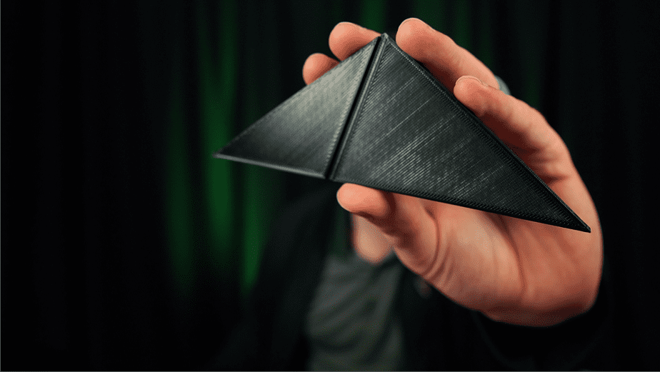
    BEHOLD THE GOLDEN RATIO!

    The ancient secret brought to life with 21st century technologies!

    Very cool.

    I’ve written about ratios and relationships before, and the thing I’m holding is my favorite ratio.

    The challenge here is to explain why without getting too deep in the weeds with it.

    Let’s Try

    Back in ancient Greek times there were two competing theories for how the universe works.

    1. Everything can be reduced to its most basic building block, the atom. The atom here is the universally useful common denominator between all things in the universe (hence the use of the term universally useful).
    2. The whole universe is full of an odorless, colorless, weightless “aether.” There are no fundamental particles; it’s all forces transmitted through this invisible gas.

    That’s it.

    SIDENOTE: In all seriousness; the debate is still going thousands of years later. The atomists think they’ve won, but they don’t know they’ve backed themselves into a corner. But I digress.

    The people who supported the first argument (we’ll call them ‘Atomists’ like I already did) had every reason to believe that you could find the universal building block.

    Let’s build their case using some good imaginary lines. We won’t even have to draw them!

    Divisibility

    Imagine you have two lengths of string. One is two inches long. The other is three inches long.

    There’s no way that you can squish three inches to fit into two inches, and there’s no way to stretch two into three.

    What you can do, however, is cut the two inch string into two one-inch pieces. You can also cut the three inch string into three one-inch pieces.

    Now you have 5 pieces of string that are all the same length.

    As a result you would say that one inch is the common unit that is the same to both pieces of string.

    This is (almost) universally true. No matter what units you measure by, you can (almost) always find a way to cut up both lengths that will leave you with the same size pieces.

    The ancient Greeks were proving this left and right. They were using this information to find the area of planes and solids. They were calculating the center of gravity for three dimensional solids.

    Life was good.

    And Then Along Came Phi

    Everything was great until it wasn’t.

    Imagine you’ve spent a lifetime proving that you can always divide string, lines, and measurements into smaller pieces to find their common “atom” size.

    And then someone shows you that doesn’t work.

    It would be like finding out your tidy explanation for life, the universe, and everything has a giant black hole at the center that’s devouring everything right in front of you.

    Warning: This knowledge got people killed in ancient Greece times, and there are people who have been driven mad by it much more recently because their minds simply can’t accept what this means. You have been warned.

    Imagine there was a length of string that you cut into two pieces. Now, when you try to cut it down into inches you realize that there’s always going to be some nubbin left over in one of the pieces.

    So the inch doesn’t work as the “atomic” denominator between them.

    You decide to try centimeters. You cut both pieces into one centimeter pieces, and there’s still a little nubbin left over.

    This means that the centimeter is not the atomic denominator between these two lengths of string.

    Your eyes narrow.

    You decide to cut both pieces into millimeter length sections.

    This will do it for sure!

    Nope.

    There’s still a suuuuuuuper tiny left over piece. It’s less than a millimeter long, but it’s sitting right there mocking you.

    That’s how you know the millimeter is not a common unit of measurement between the lengths.

    This is where the nightmare truly starts.

    No matter how short the length you use to cut the string, you realize there’s always going to be something left over.

    What you’ve just discovered is the monster that eats the atom known as irrational numbers.

    You Already Love Them

    One of the most famous irrational numbers is Pi; the number that helps you compute the circumference of a cirle.

    Tau is lesser known irrational number which is 2pi, and I think you’ve earned a momentary distraction from you existential dread with this wonderful talk by Michael Hartl about Tau:

    And, finally, I want to tell you about Phi.

    That’s what I’m holding in the photo at the top of the post. Since you’ve been reading for a long ass time already, here it is again to remind you:

    The 108, 36, 36 golden ratio triangle known as the "golden triangle."

    Yeah, that’s what it is. But what does it mean? What are you really looking at?

    The piece, at large, is an obtuse triangle with one unique angle of 108 degrees, and two shared angles of 36 degrees.

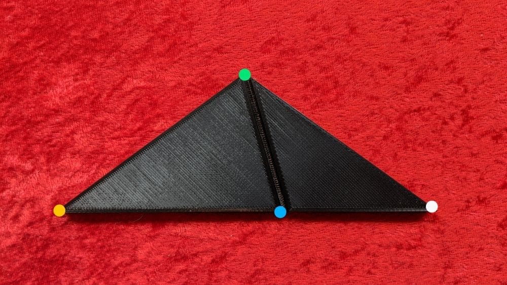
    The photo makes it look very distorted. I angled it so that the light would reflect off it. Here is a straight-on shot to minimize distortion. I’ve also added dots to reference later.

    Another golden ratio triangle.

    The yellow/green/white angle is 108 degrees. The green/white/blue angle is 36. The green/yellow/blue angle is 36, too.

    Here’s what’s neat.

    The green/blue line divides the yellow/green/white triangle into a smaller green/blue/white triangle with the same 108/36/36 angles.

    Very cool.

    You could continue to cut the smaller triangle into a smaller 108/36/36 triangle down to infinity.

    While that stays the same, here’s what will eventually drive you mad.

    The blue dot cuts the yellow/white line into two sections (yellow/blue and blue/white).

    These two sections have no common denomenator.

    There is no way to divide these two up without having something left over.

    The segments will never find commonality.

    This is provable. It’s demonstrable.

    There are simply some things that will never be reduced to their essence.

    There are things we can know. Things we can know by inference from others.

    And some that will remain a mystery forever.

    21st Century

    That’s the quick outline of what the “Golden Triangle” (or better known as the “Golden Ratio”) is, and how it was discovered.

    The implications are far-reaching, and much too big for this already-too-long post.

    Let’s wrap this thing up by talking about how I created it.

    Late at night on Twitter I asked if anyone knew how to make this idea of mine happen, and within 30 minutes I had a working file in my inbox that I could use with my 3D printer.

    The next morning I ran the file through my Ender3 to make the piece I’m showing in the photos.

    3D printers use a highly sophisticated Cartesian coordinate system to track its position within the context of three planes of motion.

    1. Forward/Back
    2. Left/Right
    3. Up/Down

    Voila. The three dimensions of printing!

    So using these very straightforward (even though they’re complex to execute, they’re pretty simple in practice) processes to create a physical object that embodies a fundamental truth of the universe.


    Today’s post is brought to you by the word: Incommensurability

  • Engagement Painting Session 3

    Engagement Painting Session 3

    The third (and final) livestream session before the painting is finished.

  • Engagement Painting Session 2

    Engagement Painting Session 2

    This is my second session painting my engagement portraits.

    (Notice how I’m repping my Urbit shirt.)

  • Engagement Painting Session 1

    Engagement Painting Session 1

    This is a photo of me with my fiancé. I’m painting it for our engagement announcement postcards.

    Instead of painting it in secret, I figured I would share the process with the world.

    Feel free to watch at 2x speed to see it come together even faster!

  • Yellowstone Campground

    Yellowstone Campground

    This was the place where Ashley & I stayed on our trip to Yellowstone. Just unreal.

  • Digital Painting Created On An iPad: A Walk Through

    Digital Painting Created On An iPad: A Walk Through

    This is a timelapse video of a digital portrait I painted, and eventually sold as a #cryptoprint on MakersPlace.

    Even though you can watch every single change made (in fast forward) it can be difficult to understand what’s happening, and why I’m doing it that way.

    I’ll explain.

    But first, give it a watch 👇


    1️⃣ Layout

    This is the first part of the video up to second 20 or so. It’s the part that has the least going on, most difficult to see, but it’s the most important.

    This is the part of the process that sets the tone for everything that comes later. If you do this step right, you have fewer problems rear their ugly heads.

    So What’s Happening?

    I’m working from a photo reference shared by the model who specifically intended it to be used as inspiration for art.

    (I recommend that source imagery, or even better something that you take yourself. Don’t just randomly search for something and then use it.)

    The point is that I have a photo to work with. The image is already defined. The ratios are right there in the source, so all I have to do is put them in the right place within the boundaries of the painting’s edge.

    Easier said than done!

    When you first start out making portraits it’s nearly impossible to do this right. Eventually you get a feel for “the right corner of the eye should go. . . there! And the outer turn of the nostril should go. . . . there!”

    The is why learning to draw is a foundational skill for learning how to paint. You need to be able to get the structure correct first unless you want to undo everything you make at the beginning.

    At the end of this stage I have a line drawing of the subject that already looks like them. Time to move to the next phase.

    2️⃣Blocking In Color

    Now that I have a map of where everything should go, time to put color in the right places.

    Do you start with the subject first and then finish the background? Or start with the background and then the subject? A bit of both, going back and forth?

    I like starting with the background and clothing first. This helps me get the general color “feel” of the painting moving in the right direction so the skin tones are more likely to land in the right place.

    Otherwise you can paint the subject first, paint in the background, and suddenly the subject looks wrong. It’s because all the colors influence each other and one color that looks great next to one color can look awful next to another.

    Color theory is weird. 🎨

    But starting with the background is a quick and easy way to get a lot of coverage of the space, and gives you a foundation for the subject.

    I like blocking in shapes of color first for skin with three colors: base, darks, and lights.

    I look for the larger shapes first, and put as many in as I can before looking to add finer detail. If I start with the fine details first I get bogged down and it takes forever with zero progress.

    Broad strokes 👉 medium 👉 fine

    3️⃣Details

    Now that the painting is covered with paint, it’s time to work with the details.

    Even though the broad strokes fill in a lot, this stage still takes twice as long as the first two combined.

    This stage is where you add in local variations of color. This is often means adding red to the nose and cheeks where the blood vessels are close to the surface.

    The eyes are especially important to get right. If you miss the mark with them the whole painting is out of whack.

    The nose is tough to get right, too. Especially from this angle. The best way to think about it is not as a feature, but as a group of unique shapes that fit together like a puzzle. This helps you actually see it as it is instead of trying to make it look like the idea of a nose that you unconsciously have stored in your Platonic catalog of “here’s what human features look like.”

    The dark hair behind the nose helps to “push” the nose forward in space and the hair functions as a sort of outline to help define the contour of her nose.

    And so it goes.

    Lay in more details, work on their placement, and blend them together. But don’t blend too much! That can make your image look overworked, and a bad blend job will kill your piece.

    When it comes to digital painting I find blending to be the most difficult part. Some of the tools will only push paint around instead of using the surface to mix them together like you can with traditional medium. This is the one place where I wish there were more tactile feedback in the process.

    But I digress. Let’s look at how blending fits into the picture (pun intended).

    Images are mostly defined by two things:

    1. The placement of details and
    2. The transitions between them

    A hard edge is a sharp transition. A round surface is a smooth transition between two details.

    So the amount that you blend two colors or values together tells your brain what the surface is supposed to look like. Hard line? Clearly defined edge. Transitions? Must be a rounded surface.

    Good General Rule: If you have a sharp transition on one side of a shape, you’ll likely have a smooth transition on the other.

    And on this process goes until it’s pretty much where I want it.

    4️⃣Finishing Touches

    I *love* adding bright color outline accents to my work. If I had to tell you where it comes from I supposed I’d say comic book art influence as a kid, but I really couldn’t tell you for sure.

    All I know is I love doing it.

    Most of the time I’ll choose an electric version of whatever color is on the opposite side of the color wheel from the dominant hue of the subject.

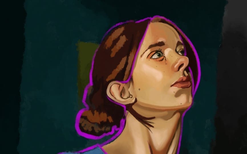
    In this case she is very yellow. Right across the wheel is purple. Easy.

    But it’s not a simple outline. There are some fun subtleties to it.

    I like to think of it as a heavy light that surrounds her. It gathers near the bottom of the contours due to gravity’s influence. It also will trace the inner contours of the subject to clearly show what is in front of the others.

    And in only a few spots you will see it casting color onto her skin.

    These tiny details help make the outline feel like it “fits” in this environment. It’s actually interacting with the subject. It’s behaving like a real thing in space more than a flat application of a single width comic strip outline.

    Getting this vibe right is often the part of the painting that I have the most fun with.

    And now that the electric outline is in place I have spent enough time looking away from the interior of the subject that I can notice that the subject is a bit flat. She lacks volume.

    The real finishing touches will be the final highlights that just touch her skin and give it the glow that tells you there’s light somewhere in this dark world.

    #Finished

    Close up detail of a digital portrait painting created by cryptoartist Jonathan Pritchard.
    Close up detail of the painting.

  • Why Do Artists Care About Ratios More Than Measurements

    Why Do Artists Care About Ratios More Than Measurements

    Let’s start with some pedantry. Yes. I know that ratios are a type of measurement. What I mean is that artists care more about the relationships between details more than they care about the unit measurements.

    You might recognize this shape as the Golden Spiral, which is born from the Golden Ratio which, itself, is created from triangles adding up in ever-increasing size.

    Take a close look in the middle. You’ll see a small triangle with another triangle right next to it.

    Then a third triangle with the same length side as the lengths of those two first triangles put together.

    Then a fourth triangle is added with a single side equal in length to the first three triangles.

    On the process goes.

    The relationship of the new triangle to the ones that come before is the Golden Ratio (1.618).


    Notice we didn’t talk about what the size of the beginning triangle is. 1 inch? 1 foot? What’s the measurement?

    We don’t care.

    The interesting part of the ratio is the relationship between the triangles. This pattern exists within the ratio of the triangle separate from the lengths.

    The pattern shows up regardless of the scale.

    This spiral can show up in a tiny seashell, in a sunflower, or wood shaving.

    No matter what the size of the medium, it’s the ratio of the pattern that stays constant.

    What Does This Have To Do With Artists?

    You might have heard about the Golden Ratio showing up in art, architecture, sculpture, photography, etc because it’s inherently beautiful.

    Whether that is true or not is a different article.

    The Golden Ratio means something to artists because artists are often dealing with ratios and the whole relationship of the parts to the whole more than they are concerned with a specific unit of measurement.

    When you’re making a portrait, the first two points you put on the canvas define the ratio of all the other points of interest in relationship to the distance you created with the first details.

    This is a game of ratios that’s defined at the very start of the process. #NoPressure

    Ratios Gone Wild

    It might help to look at obviously wrong examples to understand the “right” way of thinking about this.

    The wrong way? Caricatures.

    How in the world can you instantly recognize who its supposed to be?

    The nose is way too bulbous. The forehead way too big. The eyes way too small.

    It shouldn’t look like anyone.

    But it does.

    It looks exactly like Bill Murray.

    Why?

    The ratios.

    All the relationships between the details are correct, even if the details themselves don’t make sense.

    Artists are constantly playing with the space between details, and that’s really where the magic of the likeness comes through.

    This is why artists care less about what the detail “is” and more about how & where it fits in with all the others.

  • Front Page Feature On MakersPlace

    Front Page Feature On MakersPlace

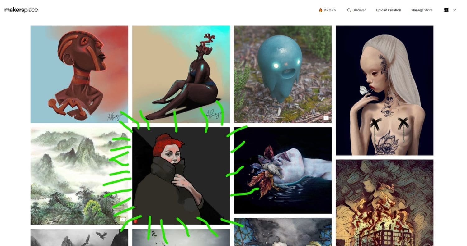
    It’s a little after 8:30 and I headed over to MakersPlace to check out what new work had been posted, and to see if anyone had made an offer on my work.

    That’s when I see this:

    ☝This is my piece “Winter Chill” featured on the home page! Really cool!

    I don’t know how they decide what images are presented here, but it’s neat nonetheless.

    Here it is in a larger (but still smaller than token) size 👇